Wednesday, November 26, 2014

Reds and Greens


Hello Everyone!  Welcome back to another Copic Oz Tutorial!  Today we are talking Reds and Greens and of course what could be more perfect for this theme at this time of year than holly?  Holly is a lot of fun to colour and you can get such fabulous effects by focusing on your contrast to really make your image POP!

Today I've used the Heaven and Nature Sing stamp set by Power Poppy and have stamped the image in Memento Tuxedo Black onto X-press It Blending Card.  My FAV reds are R32, R35, R37, R39!  A lot of people do struggle with reds, however I find these blend beautifully and I love the shades of these markers.  For greens - particularly for Christmas themed images - I always reach for G20, G21, G24, G28.  I love the contrast from pale green through to very deep green!

I've started with the holly leaves by laying down a base of G20

I've used the shading on the stamp as a guide to where to deepen the colour with G21

Deepen this shading again with G24

Then I've added the darkest colour (use a light hand), G28.  Remember you can always add a little bit more, it's much harder to lighten something that is too dark.

Lightly blend your colours, always using your NEXT lightest colour!  I blended a *little* bit of G24, then a *little* bit of G21 and finally some G20.  You don't have to go over all the leave, the parts that you leave will be lighter and be the highlight to contrast with your shadows.  If you want to deepen your shadow areas, add a little grey or a deep blue-green!

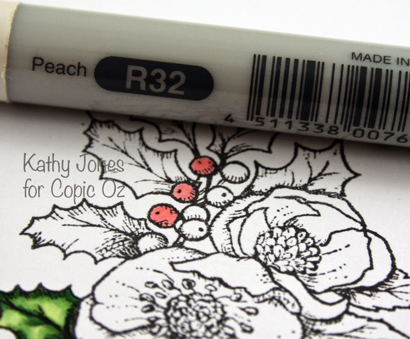
To make the berries luscious and pop of the page - I start with R32

Then darken with R35 - remember you don't have to add much and it's only on the edge.

For a little more contrast, add some R37

Now you could stay with these three colours and lightly blend to finish your berries - or you could darken them some more for greater contrast.  Below, I've left the bottom one with the above three colours, the middle berry I've added a little R39 and the top one I've added a touch of RV99 to really darken it up! 

It's up to you how bright or dark you want to go.....I decided to darken all mine!  :)

You don't have to stop your reds and greens there!  I've finished my image off with lighter reds for my peachy-toned flowers and different greens for their leaves.
Flowers - R11, R12, R14
Leaves - G40, G82, G85, E21 (for a slight browning effect)
Flower Centres - Y21, Y28

I hope you've enjoyed today's tutorial, thanks for popping by and if you are colouring Christmas themes right now, why not leave us a comment where we can find you!  We'd love to see what you create!
Happy Colouring!Pin It

Wednesday, November 12, 2014

Testing Copic Marker Shadow Colours

Today I'm taking a huge leap and experimenting with different colours to add interest to shadows.  Now I'm not sure if you've seen this post but in it, Mandi-Lee talks about using complimentary colours in your shadows for extra wow factor.  I've previously tried using the BV family and even the occasional B, but I was wondering what else might work other than complimentary colours.

To test some combinations, I created a grid using a single Copic colour marker and a single colour for the shadow - not the easiest blending combo in many cases, but this provided some incredibly interesting results!  I was expecting many of my shadows to look pretty awful, but was quite surprised by how good so many of them looked - some of these colours even blended rather well!

Now for the best results ideally pick a colour darker than you are colouring with, (this didn't always work out that way the way I did this), as a result some of these colour combos may have looked better with a slightly darker colour for the shadow.  Also though I didn't use them here (as we know these should work),  don't forget about the complimentary colours when looking for shadow colour options!

On to the test...

First I tried some of the light/bright colours - these were a bit tricky to blend and some of the combos turned out a bit interesting, the yellow in particular proved quite fussy.


My favourites for shadows on:
  • BG02 were W3, BV00 and R02 - though C3 was also ok
  • YG05 were BV00, B01 and W3
  • Y02 were B01 and E02
  • V04 were C3, B01 and W3 - though some of these aren't really shadows but they do look great!
  • E11 were C3, BV00, R02, E02 and W3
All in all, there were many more colours than I was expecting, that produced great results, though not all results are 'shadows' exactly!

Next I tried some mid tones and darker colours - I think these were even more successful, but again I ended up with some interesting combinations. 


My favourites for shadows on:
  • V06 were T5, BV17, G28 (closest to complimentary colour)  and B37
  • RV29 were G28 
  • B08 were T5, BV17 and B37
  • YR09 were RV19, TR18 and B37 (closest to complimentary colour) 
  • YG67 were T5, BV17, G28 and B37


It turns out there are many more choices for interesting shadow colours than I originally thought, and not at all what I would have predicted!  I had hoped to find some pattern to what works - something like the complementary colours - but it seems to be a little random.  I would encourage you to try your own version of this to find exciting options for your shadows!

If you're a bit nervous then the amazing team at Copic have made it easy for you with the new Copic Colour Wheel.  For reliable shadows with the wow factor,  try using the complimentary colour for the marker you have chosen - you will find potential colour choices opposite your chosen colour on the new Copic Colour Wheel.

Back with more soon,
Kate

Pin It